NATIONWIDE PHARMACEUTICAL
Nationwide Pharmaceutical Visual Identity Redesign
Role: Art Director
Focus: Visual Identity, Website, Stationery
Focus: Visual Identity, Website, Stationery
Overview
Nationwide Pharmaceutical is a licensed pharmaceutical, medical device, and Over-the-counter (OTC) Food & Drug company in Texas. In this project, I used visual language to redefine the brand across marketing & communications assets and new brand collateral.
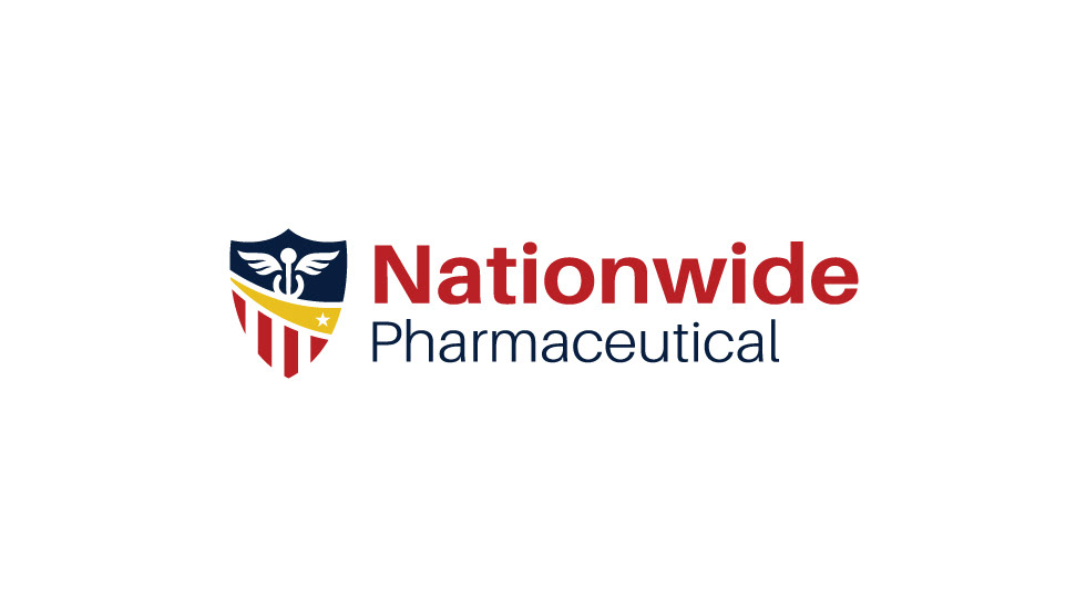
Original Logo
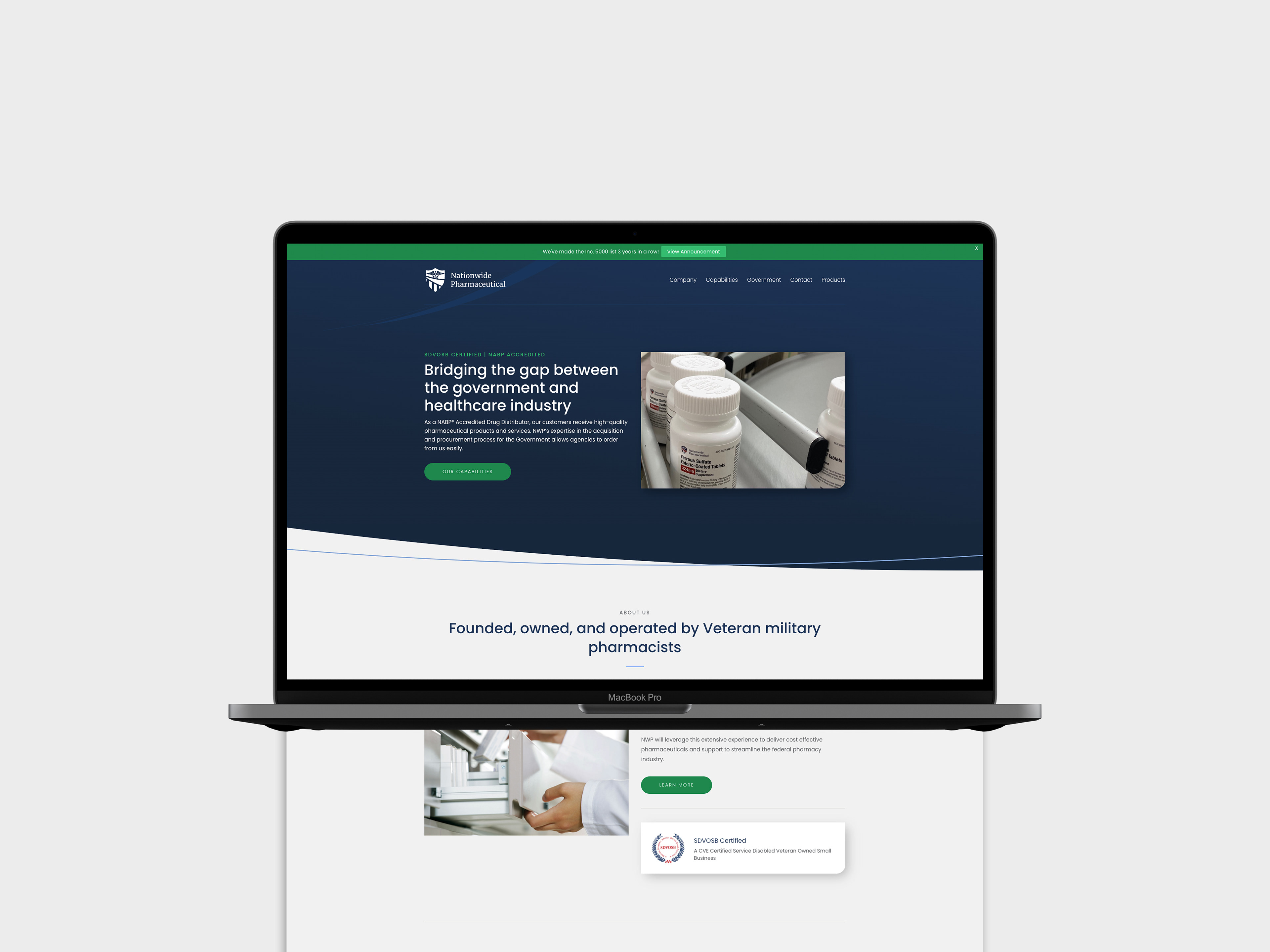
Original Website
Challenge
The challenge was to create brand consistency across various media. This included simplifying the original logomark, creating fresh collateral, and redesigning a dull site into an exciting, action-oriented one.
Approach
This project started with refreshing the original logo. Initially, the main tasks for refreshing this logo were to simplify the caduceus rod, expand the color palette, and modernize the text treatment.
First Draft
We started by changing the shape of the shield to make it sharper and sleeker. The middle ribbon was made more fluid and incorporated the star, since the company is owned and operated by veterans. We removed a lot of detail from the caduceus rod, which would make it more legible in print and when scaled down. Next, we added the color yellow to the palette to further separate the logo's sections, a color often used in other media for the retired military. Then, to make the logo text more modern, we switched to a sans-serif font.
In our presentation of the first concept the client's initial feedback was the following points:
- Snakes in the rod of caduceus look like a horseshoe
- The text looks too similar to the Nationwide Insurance logo
- Incorporated an element from the Medical Wholesale logo (a division of the company)
- Not fans of the color yellow

Medical Wholesale Logo
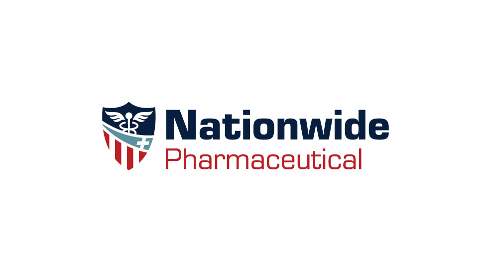
Approved Logo
To address the client's feedback I changed the shape of the snakes to move in an oval shape so it wouldn't be confused with a horseshoe. Next, the yellow was changed to blue, which is more in line with the medical aspect of the company. The star was changed to the plus sign similar to the one used in the client's logo for Medical Wholesale. Finally, we change the font from Roboto to Eurostile to avoid resemblance to Nationwide Insurance.
The next part of this project was brand collateral, including a business card, letterhead, notebook, post-it notes, mousepad, and mug. This was the opportunity to create consistency across different mediums, so we made sure to use the font and colors from the logo in the stationery, while using the middle ribbon of the logo to further creat visual interest.
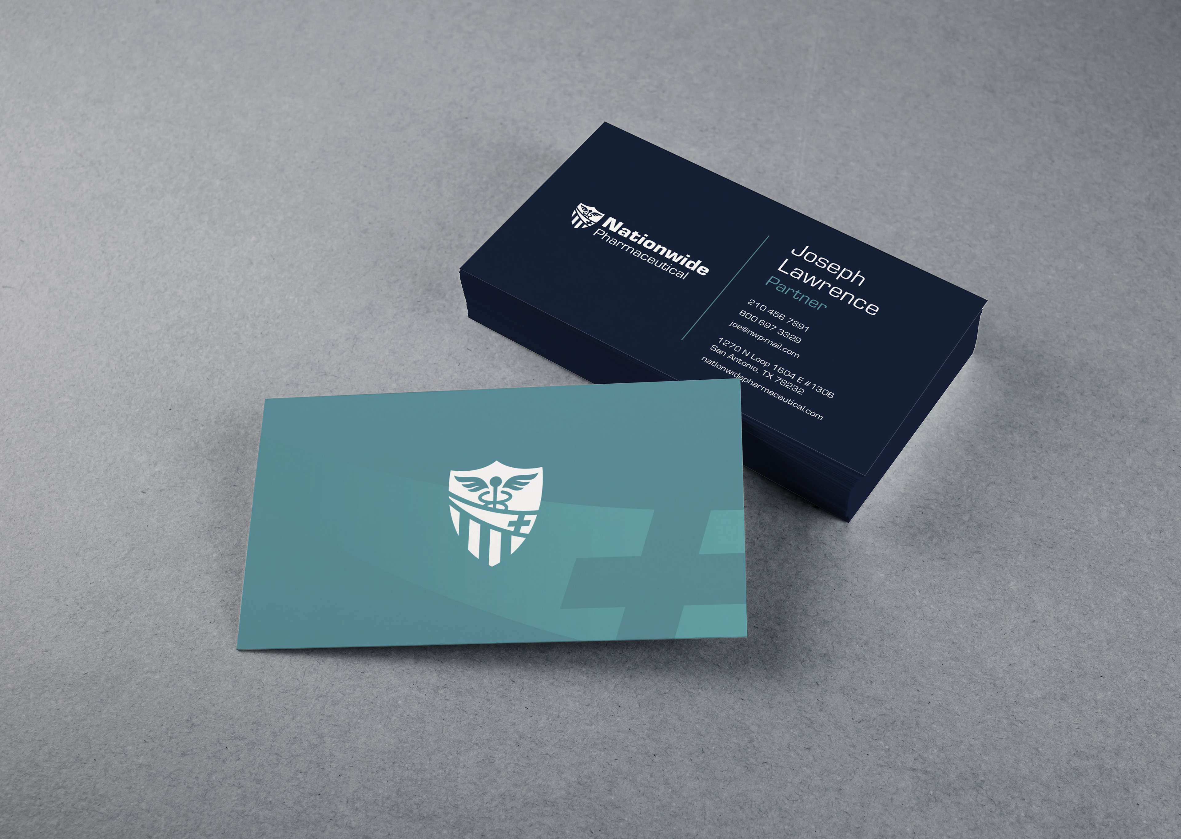
Business Card
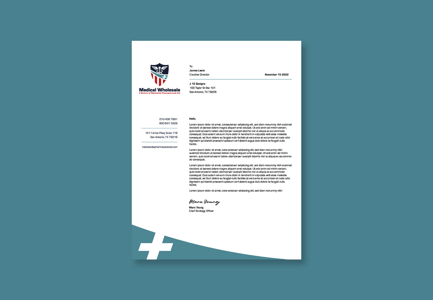
Letterhead
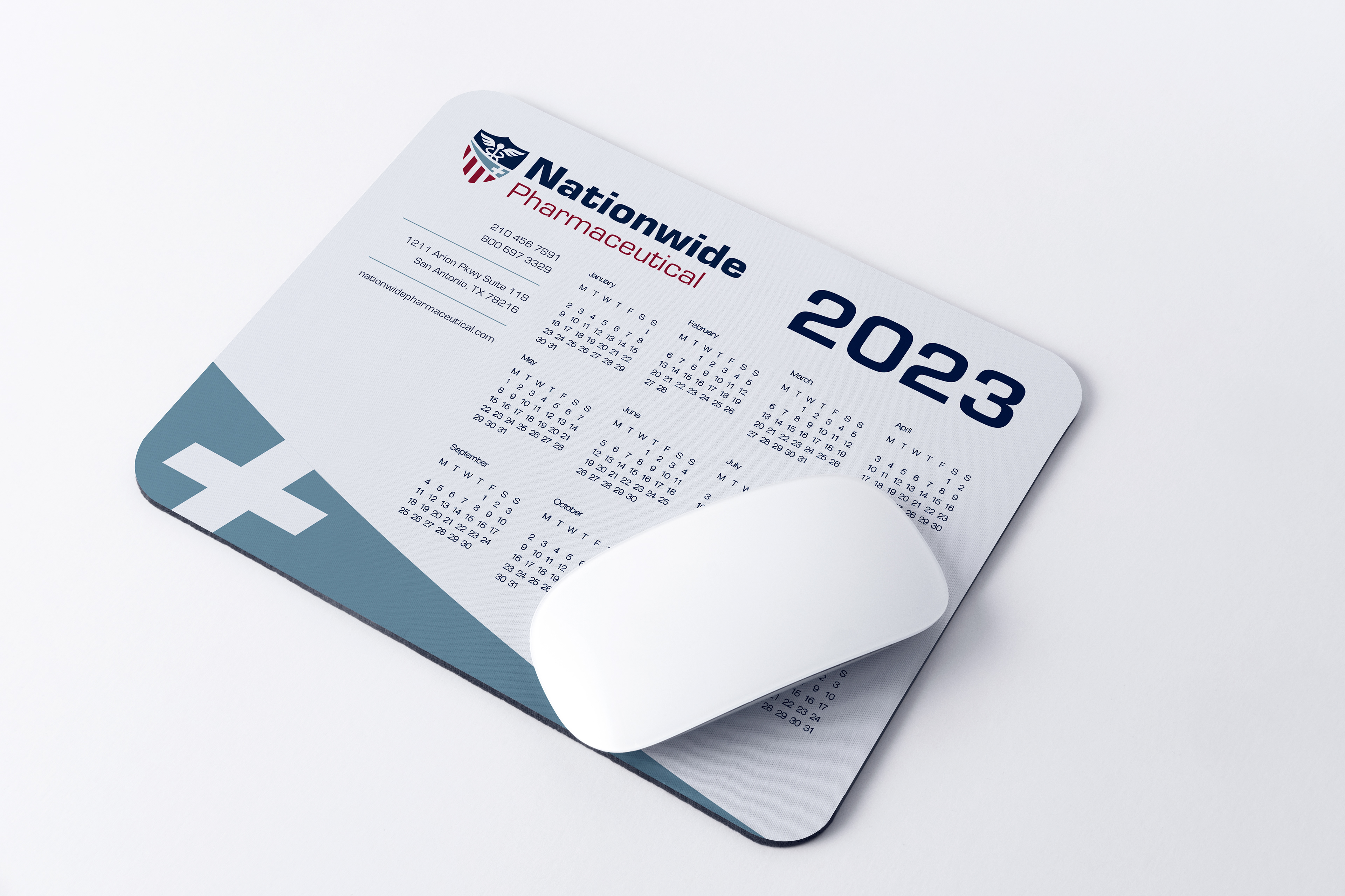
Mousepad

Notebook
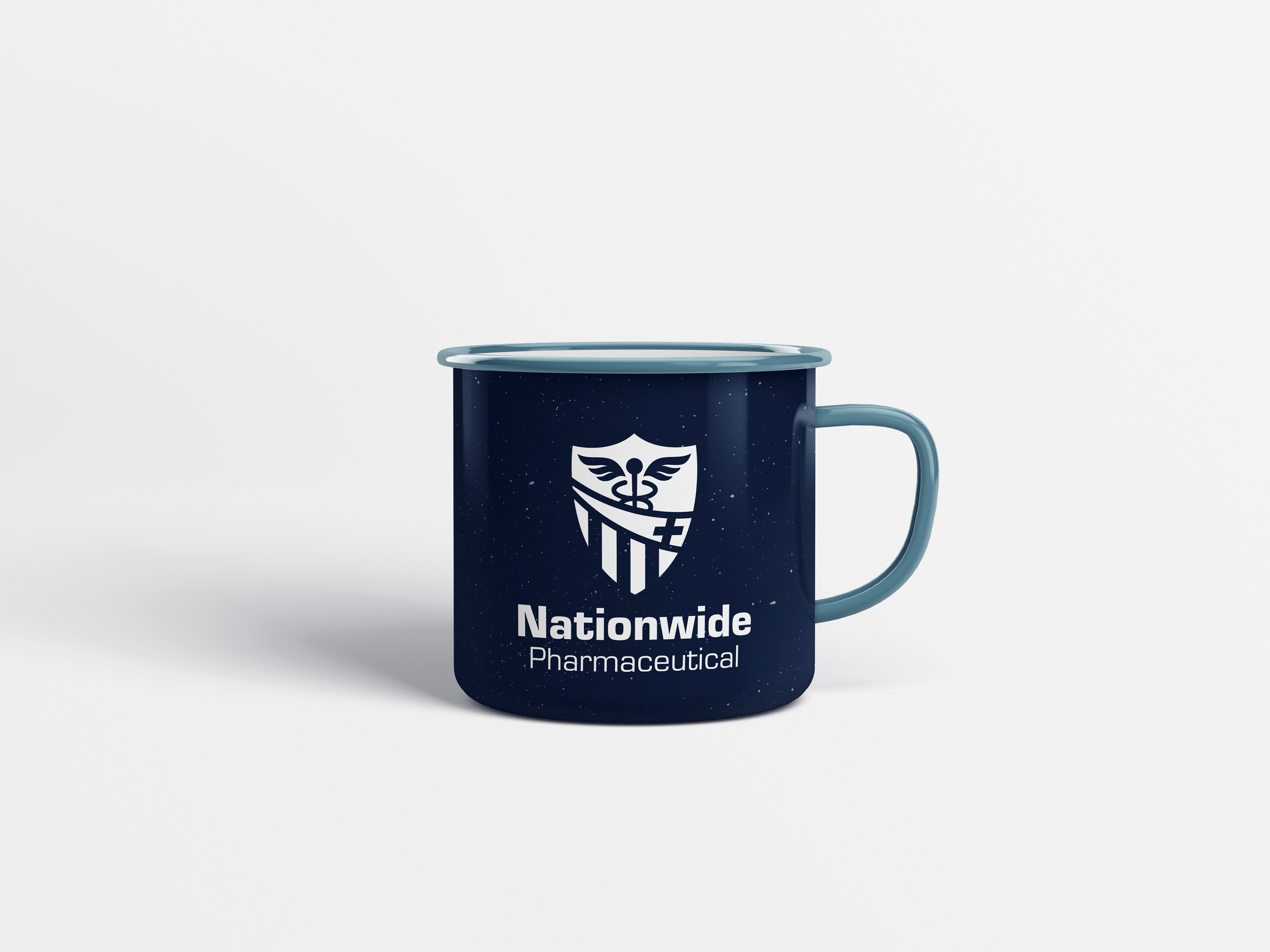
Ceramic Mug
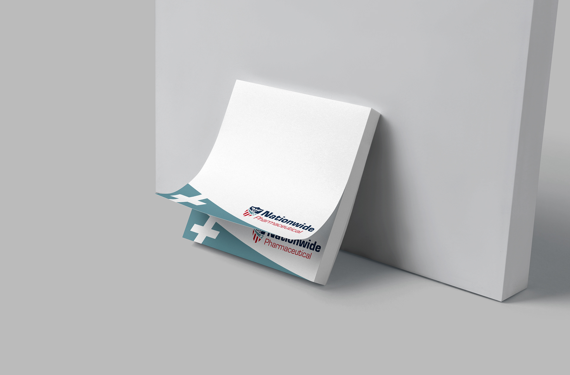
Post It Notes
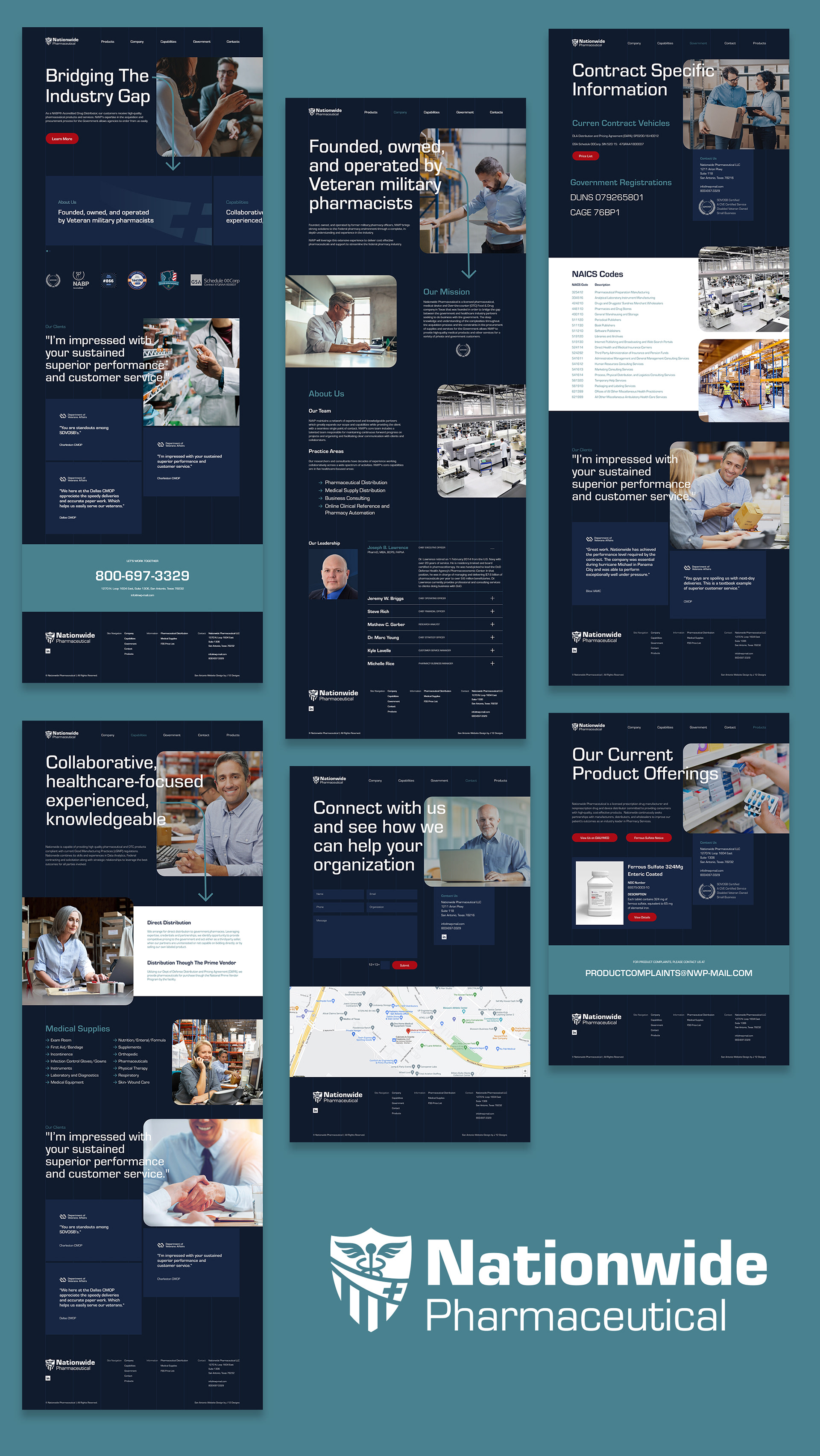
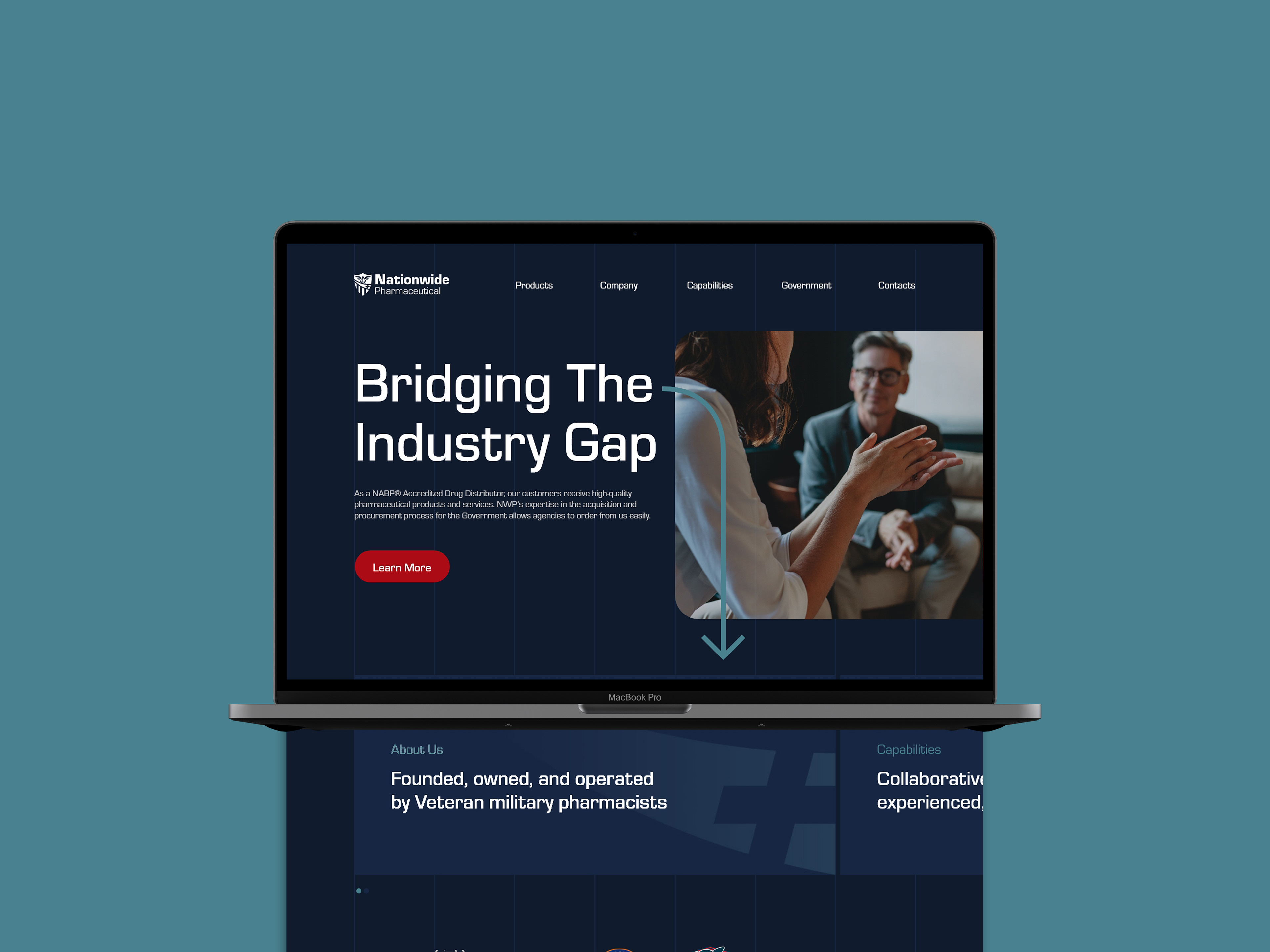
The last part of this project was to create the website, in our talks with the client, they loved how dark navy was used in the business card, so when I was looking for inspiration for the website I wanted to see how other sites used dark themes.


Similar to the brand collateral, we used the colors and fonts from the logo across the site to further establish branding.